Category Archives: Intimacy

Exercise 3: Material Differences

Concluding part 4, we were asked to create a final drawing culminating from our previous exercises, just on a larger scale. As I sometimes find it a little physically difficult to work on A1 size paper, I decided to go for A2. I definitely need to pick up an A1 drawing board as I only have smaller sizes. I love the personal feel that comes from drawing interiors, it’s a very intimate look into someones home and this has been my favourite sections of the entire course so far. Overall, I believe this image is quite successful.

A2 paper

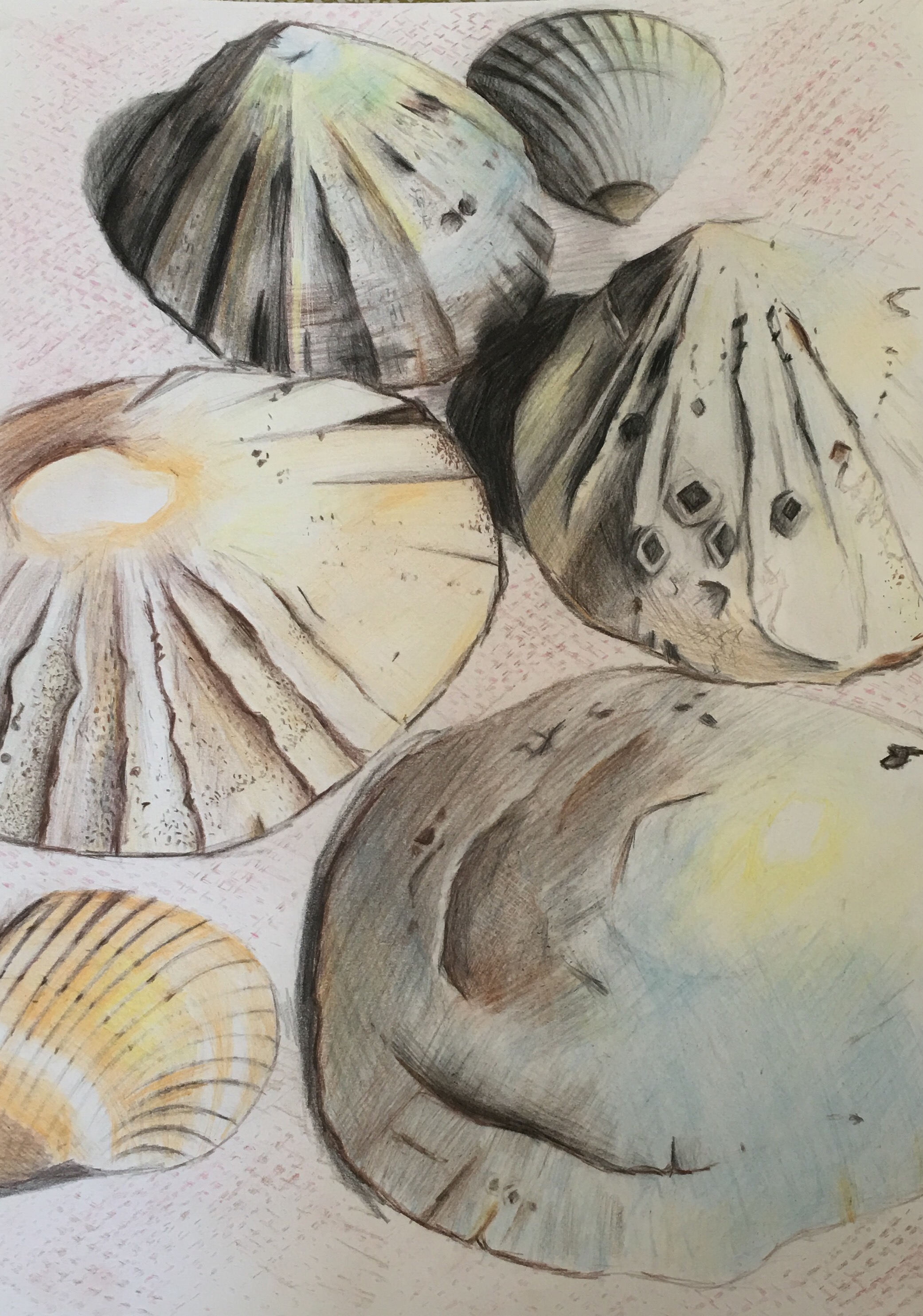
I started off lightly sketching out the chair. I tried to place it at a unique angle with a hint of foreshortening and I think I achieved that, even if only subtly. I actively chose to not overly exaggerate the visible depth too much, although I could have been brave and created a startling, almost uncomfortable version of reality and a disproportionate chair. Something I wish I had done in the previous exercise to this was create small, exaggeratedly foreshorted drawings of my chair and just see how far I could actually have taken it. I always have a lot more confidence experimenting in my sketchbook. I definitely still need to work on bringing that freedom and creativity into my final pieces, as I do have a tendency to ‘tighten up’ on my final pieces and not take as many risks.

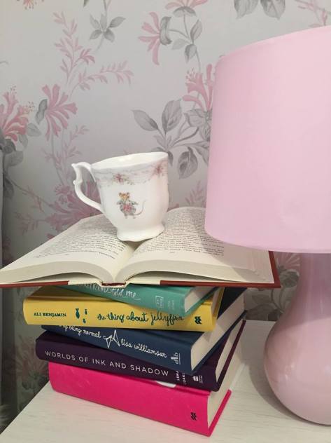
I then drew in my small side table behind in pencil, which isn’t particularly successful. I wish I had added some clutter to the table, maybe a lampshade, a mug, or a book, as its not particularly obvious as to what it is, and appears very plain. This could also be because of my hesitation, I worry if a drawing is too ‘busy’, the quality may be compromised as I try to simply finish it, and I could draw a wonderful chair but completely ruin it with an immature addition of a lampshade that is inaccurate and looks out of place. Hopefully as time goes on I will become way more confident with pulling together objects and harmonising them together in one picture.

There wasn’t too much tonal difference within this image, however I did try to make an effort to darken underneath the chair, and also within the creases of the fabric itself. I definitely could have made more of a dramatic play on the shadows however. I think one of the more successful parts of this drawing is the arm of the chair, I think I have managed to capture the depth of the design, even if it is slightly simple, it’s incredibly effective.

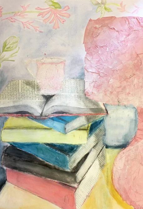
I found that adding colour was one of the hardest parts of this drawing. I think black and white images often look better and more realistic, and adding the wrong colour, unless used for effect can make an otherwise wonderful image appear uncomfortable to look at. I started off used colouring pencils, but had trouble filling large areas neatly and smoothly with such a fine point, so I moved onto soft pastels instead, which worked a lot better. I worked much faster using them as well, as I was able to quickly fill large areas of space and could blend colours together easily. The more I practice with pastels the more skilled I am becoming with them. The mix of pencil and pastel works together to create a lovely rich tone, like how you can mix paints together to get your perfect shade, I occasionally find that often using a pencil straight from the packet creates a very childish and unnappealing colour, bute blending and combing with others allows you to end up with something more true to reality.

As a final touch, I cut up flowers from a sheet of wallpaper and stuck them on in the background. Although I really love the sketched flowers in previous drawings, I really love incorporating mixed media in my art. Overall I have achieved a very simplistic, but bold picture with strong blocks of colour and hints of detail here and there.

This has definitely spurred on my desire to constantly draw other areas around my house, I got so much enjoyment from these exercises and I’m actively making an effort to notice things around me nowadays as well, sharpening my perception skills and being more aware of subtle objects I would previously have overlooked. I’m definitely honing my skill of looking at the world through the eyes of an artist and grabbing inspiration from all corners.


Exercise 2: Composition – an interior

I was next asked to complete around four more drawings, building from an image within the previous exercise and focusing more acutely on one place. This culminates in a more final drawing later on Our main focuses were experimenting with multiple positions, angles, and viewpoints in order to create a drawing with the best composition possible. I always have to make sure I have an observational position that allows me to sit down comfortably, as standing for long periods of time is not beneficial to my health. I decided to chose my armchair, and so having a smaller stool at my desk, I was able to perch on that and work from there. I chose my chair as I’ve not worked much with fabric, and I spend a lot of time curled up there so thought it was an accurate representation. I also thought I could possibly begin to experiment with the idea of foreshortening as well, and maybe just slightly exaggerating the way the chair looks.

My first drawing I started in pencil, then moved on to adding colour with dark grey and pink sharpies. Even though the technical drawing isn’t perfect, I believe if I had taken the time to properly colour the chair, and not just briefly scribbled a drawing, it could be quite an effective drawing. It’s definitely an extremely strong medium that I am looking to use in the future. I really like the loose sketchy flowers of my wallpaper, I was able to draw them quite effortlessly and they look good.

This exercise asked us to constantly shift our viewpoints and consider using different perspectives. I was so glad I was pushed into working like this as I definitely wouldn’t have been creative or brave enough to go ‘outside the box’ naturally. In this drawing I focused on noting down the tonal values, and although the shape of the chair isn’t completely accurate, the tones within are. I really like how I managed to start depicting the creases and folds within the cushion, I feel like it looks pretty realistic.

I really like how my side table turned out in this one, I put a lot more detail into it and its paid off. I also drew my little footstool, but if I were to do this particular picture again, I’d definitely turn it around so it runs horizontal against the chair, not vertically, as it awkwardly breaks the composition up and feels very out of place. I like the darkness I put into the creases of the chair, I’m really trying to make an effort to use a confident hand and avoid light cautious marks, as it really makes for better drawings.

We were asked to do multiple studies, both vertical and horizontal, and I ended up really liking this composition. I almost considered it for my final piece, but ultimately decided against it as it felt very ‘safe’ and I wanted to draw something perhaps a little more out of my comfort zone with a bit more interest.However, I considered the colour usage within this study, figuring out schemes that worked well together but were still relatively true to reality. I used slight artistic licence, as, in reality having mostly very washed out pale, white, pink and greys in my room I exaggerated for a more interesting picture. I used coloured pencils and definitely find smaller areas like this easier to fill neatly.

Looking back over all these studies, I feel like the portrait studies just worked a little better with the subject than the horizontal. I like being able to play on the height of the chair.

I really tried to work fast during this exercise. Traditionally I spend ages carefully drawing and erasing lines and reworking but sometimes you just need to do lots of quick sketches to get a feel for the subject and then move on. It forces me to work instinctively and intuitively, and most of the time it ends up being a much fresher, natural drawing. Overworked pieces can end up being dull and I have a tendency to focus on the smaller details and not on the bigger picture. Speeding up forces me out of this mindset. This often leads to multiple messy looking sketches, but an in depth and coherent study of a subject

One thing I wish I had done was create more drawings in different mediums. I stuck to pencil throughout and I should definitely have used charcoal, pastels or conte sticks as well, even biro. They bring out a completely different mood to your drawings and it would have been really interesting to see how it might have changed how I saw my chair. Previously I’ve always tried to use a wide range of experimental media, but in all honesty I think I just forgot, so I will be making a mental note for the future.

Project 3. Exercise 1: Quick Sketches around the home

In this exercise, I was asked to draw sketches of multiple rooms in my house. I really enjoyed this, completing this slowly over a couple of days. I made the decision not to use any colour, just wanting to get the basic details of the room on paper first, then perhaps in further sketches I could add colour. I realise these photos don’t do the drawings much justice, they are much more vibrant in person.I used an A3 sketchbook.

I started off this exercise in my bedroom. As this is the one room in my house I have furnished and designed completely to my own tastes, I definitely believe it’s going to be the place I feel the most inspired. I started off  by drawing my chair I spend my time reading on. I tried to quickly portray the fluffy texture in the cushion, however could definitely build on it. There wasn’t much variety in medium involved in creating these simple drawings, besides using a few different shades of pencils, HB, 2H, and B. Once I drew the basic forms, with as accurate perspective as I could manage, you can also see the beginnings of tonal value shown on the arms. I also didn’t include the wallpaper or carpet, an important finishing step in any drawing.

This is one of my favourite parts of my bedroom, my bookcase paired with my  curtains and a window. It makes for a visually pleasing composition. I am an avid reader as mentioned before, so it’s inevitable I would use books as subject matter for a lot of my drawings. This is one of my favourite pictures, the natural light outdoors coming in from the window paired with the manufactured bookcase creates such a diverse, unique image. There’s slight tone on the window-ledge and for one of my very first times drawing curtain fabric, I believe I was was pretty successful, although could definitely have been more dramatic.

I decided to try with different size drawings too, so decided to split my page in two and draw something on an A4 size paper. I’m not particularly happy with my bed drawing, I found it extremely difficult to draw, stood at a very awkward angle, and didn’t include any background. I tried to depict the creases in the bedsheets and pillow, and although the basic form is accurate, it couldn’t be said to be a complete drawing. However, I am pleased with my door picture. I live on the ground floor so have a door leading out into the garden, so, the idea of window and doors giving a glimpse into the outside is very appealing to me. I hinted and the brickwork on the floor as I thought initially it would be too distracting to draw every single individual brick. The contrast between the natural outside world and the manufactured building makes for a really interesting picture. On the ends of my curtain rails and hook, there is a sparkly glass decoration and I really struggled depicting it accurately, I think if I used charcoal and focused on drawing it alone I would do a much better job, but as I’ve never drawn glass with pencil before,  I struggled.

I continued trying to experiment and try new things in this exercise. Upon seeing my desk, I initially considered drawing it traditionally horizontal across the page but could not find a comfortable viewpoint and position to work from. So I thought outside the box and stood at a different angle, seeing how it would look lengthways instead. Although not perfect, I’m really impressed with my creativity. I definitely need to practice more into how to portray carpets and flooring, as I gave no indication in this drawing. I tried sketching in a very loose, free sense, with a darker pencil and experimented with a unique perspective and an extreme sense of depth. Although extremely tricky to depict, and as a whole I’m not all too pleased with the composition, as looks a little off balance, it was a big learning curve.

This is a very basic sketch of my kitchen, as I look at all these drawings I am regularly realising I needed to add more tonal values into these pictures, they look incredibly  ‘unfinished’, but at the same time I have the beginings of multiple pages of notes on different parts of my home. I think my progress and visual representation of bigger areas has improved a lot, and you can only compare progress with yourself . I really like the round stove chimney in the middle of the drawing, I think the variety of shapes and depth works well as I’m traditionally just using . I feel like one of the consistently successful elements in most of these images are the composition, I believe I have a fairly instinctive eye for that.

This was one of my most quickly and roughly done, and subsequently most inaccurate drawing. I really quite struggled with this fireplace. With all the different almost mathematical lines that made up, I found it hard to find a starting point, and to deconstruct what I saw in front of me, I just personally found a little overwhelming. There was too much similar detail to be able to focus on one part. I feel like its very basic and childish looking, but sometimes it’s important to do speedier drawings and then move as  I tend to get stuck down in the intricate details and spend far too long on one part. The more drawings I do, the more naturally it will come.

This time I moved into my dining room, and my favourite part of this piece is the jug of flowers that sits on the wood table, as it has strong lines, a hint of shadow on the table and even some tonal indication and it makes such a huge difference. I also really like the idea of drawing art within a piece of art! I think the bird picture on the wall is really interesting and looks really effective so I will definitely be using that in subsequent pieces. The second drawing on this is a clock in the hallway, and a window outside overlooking a gate and a few trees. I think the tonal shading within the clock is well done, and probably one of my neatest, most accurate and detailed drawings to date. I began filling in the background outside the window behind as well, if colour was able to indicate the gate, houses and trees it would make even more of a impact.

I have a very disabled friendly walk in shower, with handrails and a stool. After drawing this, I had a the idea of a set of paintings based around the idea of disability, depicting what life is like when you have a long term illness. The reliance on modern technology and the internet to keep up with friends, all the medication, abstract depictions of pain and headaches.

This was again, some of my first basic attempts ever at drawing fabric. I hope to practice more in the future and get so much better at it, but considering I have only used my observational skills to depict this, with no tutorials or guidance, I have done quite well. There were lots of doodles and patterns on the blanket that if I were to draw this again, I would liked to have included, maybe in pen, using a jet back fine liner.I drew more of the flooring and wall paneling in this which I think, even if not immediately obvious exactly what it is, finishes off the image to make it look complete.

Using the inside of my house as inspiration, for someone who can’t often get out and about very often due to illness, has been so brilliant. Only having to stay within my own four walls and exert my energy on making the art rather than finding and creating the subject matter is a much more enjoyable experience.

All in all, I feel like two of my most successful drawings are

  • The one looking outside my bedroom door, onto the garden
  • My bathroom

They work the best because they have the most tonal contrast within. It was a big lesson I learnt upon looking back, and will endeavor to always use a more confident hand and a darker pencil when drawing in the future. I can get stuck using a light touch and hesitant marks, for lack of confidence in my ability and fear of messing up. I know that I can always start over if I mess up that bad. Another thing I learnt was to always include background detail because it can really finish it off.

I like how big some of these drawings are (A3 size), taking me outside my comfort zone, but also believe that if I had maybe not been quite so ambitious, I could have perhaps finished the drawings a lot quicker and therefore got a lot more detail in.

Exercise 4: Monochrome 

This monochrome exercise as a way of looking deeply at tone, not just at the surface colour within an image. We were asked to use both natural and manmade objects, and contrasting materials.

I started off with trying out a couple of different subjects, for example a fish on a plate, which personally didn’t work for me. I then tried a banana and orange in a fruit bowl composition but that also didn’t work. Eventually I came across a vase and some flowers and thought it was perfect. In these last few exercises I have really learnt the value of testing out loads of different compositions and layouts before finding the perfect one. It may take time, but it’s worth it.

To help with visualising my drawing, I was able to edit a photograph of my still life into black and white, which gave me a strong basis and reference point to return to. It is definitely a great idea when looking at the tones in an image, and is something I will be continuing to do in the future.

I collected up and used a mixture of both coloured pencils and watercolour pencils in blue, using the latter medium for the very first time. Although I had used my sketchbook to practice a range of tints and shades on one pencil, I hadn’t tested every single colour I was planning on using, which resulted in me accidentally finding a much nicer shade of dark blue halfway through the process, and having to build up a lot of pigment to cover the first layer of ultramarine.

Using  watercolour pencils is a very different experience to using traditional pencils. I really like the soft, expressive, almost glowy look it gives the flowers, and how easy it is to move the pigment around on the paper once applied. I found it worked best if I drew a block of colour first then added the water with a wet paintbrush to soften it out and move and blend it. I also experimented with placing the water first and colouring over that, but found it did not give strong pigmentation and ultimately left striped pencil marks that couldn’t be blended well. Often, I would let the drawing dry and then continue adding colout and depth on top, creating a very multidimensional image. I really focused on depicting all the different tones and I feel like the flower especially is very successful.

One of my favourite parts of this drawing is the top left hand corner. It’s a very subtle, yet full of interesting background and texture. It has a great balance of colour and a range of tone. I also really like how the composition was made interesting by making the vase slightly off the page, giving the illusion of size and depth.

I struggled with the details within the vase however. I had been working in such a loose, free style and to tighten up again felt very counter intuitive, the marks I made felt very messy and unplanned. I don’t think the ellipse looks quite right either. If I were to do this exercise again I would definitely spend more time penciling in accurate proportions and details before filling in in colour. However, the vase is genuinely hand painted so there may be some people who really enjoy and appreciate the quirky detail I tried to reproduce. I also really didn’t focus enough on reflecting the light reflected in the ceramics, it looks very matte when it was incredibly shiny. I need to remember to look at the highlights when drawing manmade objects.

I started this drawing in my sketchbook as the paper within was relatively thick and I knew it would hold the water well without bobbling or buckling. I wanted to practice without worrying about the finished product, and found it worked even better than expected, so ended up using it as my finished exercise. I have the ability to cut out the image as if just on an A3 sheet of paper if necessary, but thought I would keep it attached for now.


Project 3, Exercise 3. Experiment with Mixed Media.

This exercise asked us to use a variety of art media to depict a creative still life. I started off by arranging the objects I wished to include, and took a few photos of various compositions. After a lot of trial and error, taking away and adding objects, I came to my favourite, final composition.

Experiments

mm orig

Final Composition

I feel like this is a very successful composition. With the rule of thirds splitting up the page nicely, the lamp simple but powerful as it spreads off the page, and the quirky arrangement of the teacups makes for a very satisfying picture.

mm

Final Piece

I had so much fun creating this artwork, and I personally think it’s my best work so far. Within this mixed media still life, I used

  • Watercolours
  • Soft Pastels
  • Tissue Paper
  • Book Paper
  • Thin white paint
  • Pencil
  • Black Sharpie
  • Wallpaper
  • Thick coloured Felt Tip pens
  • Texture Paste.

I primarily focused on experimenting and testing out materials for this exercise. I used materials I wouldn’t otherwise be brave enough to try within my art (ie. sharpies and felt tips!), materials I wouldn’t have ever thought to use within my drawings (wallpaper!) and materials I would never have imagined could work well together within the same image (paint and pastels!)

I started by penciling out the composition, and collaged on the papers. As I was loading so much product onto a single sheet of plain white paper, adding thicker layers was a huge benefit and created a much sturdier base in which to work on. In hindsight, instead of blindly trying to cut out the exact shapes I needed, I should have just collaged the paper on at the beginning, drawn my composition over the top of that, and then used white paint or gesso to white out the areas I didn’t want.

A particular part of this drawing that I believe to be work extremely well is my use of shadows and shading. I really feel like I’ve captured a dramatic difference in tone, especially around the lamp, and in the corners of the walls, and my active attempt in improving that has paid off. I also really like how the open book sits, it has a lot of depth to it.

I struggled at first with harmonising all the various mediums to create a smooth and coherent image. Pastels and paint, for example, create very different finishes and effects and it took some practice before I could blend them all seamlessly.

I also struggled with the teacup, I think it looks ever so slightly flat and washed out. I used texture paste which unfortunately gave a small, intricately textured detail when in actual fact I should have aimed for a smooth blank medium. I think I would use card for that particular area if I were to do this exercise again.The very final part of the drawing I did was the watercolour background, which unfortunately did not hold particularly well to this thin paper and created a bumpy, rather soggy looking background, but I built the colour up and have learnt to use good quality watercolour specific paper for future projects.

I did not take time to sit and do lots of sketchbook drawings, or media trials, something I am definitely going to make the effort to do in the future.

This has been a great exercise in loosening up, being less worried about sticking to tried and tested methods, and being a little more creative. Naturally, I am a very technical person so I learn easily but I am also a huge perfectionist and it takes a lot for me to be spontaneous or try new things. Even with this small portfolio of work so far, I can see that  I am already coming on leaps and bounds. One of the most important things I’ve learnt from this exercise was to take risks, try new things and if it somehow ends up wrong, you can start again.

Project 3 Exercise 2: Still life using colour

This exercise asked us to use a couple of different coloured pencils or pastel to sketch a still life in various tones. I chose pencils a I have worked regularly with them before, however I would like to repeat this exercise with pastel at some point, to see what differences would occur. It would have a lot looser, blended finish.

img_0240

img_0177

The photograph doesn’t do this drawing much justice, and is definitely better seen in real life. I started by shading in the darkest tones in brown, then the orange, then the yellow. I layered colours and kept looking at the shadows and overall image to check I was portraying the tones accurately. This is something I’ve struggled with before, so an entire exercise dedicated to tone was extremely helpful and I learnt a lot.

A part of my drawing that I think worked well is the roll of tape, each colour was chosen carefully to portray the 3D object. Although a few the overall technical aspects of my drawing aren’t perfect, for example, the line indicating the bottom of the table is messy and should be crystal clear, I should definitely have used a ruler, however I focused primarily on the variety of tones within the image. Another part of my drawing I feel is successful is the blue reflected line on the vase, it adds a hint of depth.

One of the parts of this drawing I struggled with was cross hatching the coloured pencil lines and making it look natural. Occassionally I simply shaded in just one direction which made it feel very flat. I also really struggled with the perspective of drawing the book in the back. There is something not quite right about it and I can’t figure out what. Difficulty with perspective is something that I notice cropping up in my work regularly, but in part 3 I should learn a lot more about it and my work should come on in leaps and bounds. The more I look at my final drawing the more I see inaccuracies.

Throughout the process of drawing and adding darker tones, the sense of depth came and went. It increased when something of a lighter tone stood in front of a darker object, but as I kept adding colour, it sometimes faded into the background and blended together. I could definitely do with exaggerating it. The roll of tape in front of the other objects helped the most to create a sense of depth, but I could’ve done with pushing the objects even closer together.

Being restricted to using tone wasn’t as difficult as anticipated, I didn’t feel suppressed or stifled in my working, it just took a little bit of forward thinking. The main challenge I found was having to think twice about what colours to use, I couldn’t just instinctively go for a green if the object was green, I really had to look at what shade of green it was and how dark it was in comparison to the object next to it. Editing my reference image to a black and white tonal picture helped a lot. I also found that not having to focus too much on the details was a big learning curve, although it is in my nature it gave me a sense of freedom to just look at the entire big picture, use broad sweeps of colour and not get stuck on the irrelevant details. Sometimes I could spend an hour working on a small complex part of a drawing, only to realise it isn’t accurate to the overall composition, and having to start again.

Using colour in this way was a really interesting experience. I picked orange, yellow and brown, with a hint of blue as I felt they all worked together well. I did a little bit of research into colour theory, and revised the knowledge that even though yellow is primary and orange is tertiary, due to the fact they are right next each other on the colour wheel they are complimentary colours and aesthetically suit each other really well. Brown is a dark mixture of all the primaries, and I chose blue mainly to deepen further the darkest areas of colour, although in theory could perhaps a little bit out of place, it ended up blending in nicely and added a nice amount of depth to it. Not using true to life colours was extremely challenging and very helpful, I had to take more time to think about the actual tones that these colours produced, not just looking what at the basic colour an object is.

I decided to stop after I had finished and move on to the next exercise, rather than repeat it immediately. This wasn’t because I thought my final piece was perfect, but I am planning on revisiting a lot of these exercises in the future.

Project 3, Exercise 1: still life using line

This exercise asked us to select objects that were either similar or deliberately contrasting each other. I initially picked up a whole load of twigs and set them up in a still life, however after a little bit of sketching practice I decided there wasn’t enough interesting variety and the sheer volume of sticks I had in front of me was very confusing to draw on paper. I eventually settled a small selection of natural objects and set them up in what I think is an aesthetically pleasing diagonal composition.


To create this drawing, I lightly sketched the outline of the objects in pencil on a sheet of A3 paper, and then using ink, a barbecue skewer stick, and a dip pen, went over all the faint lines and added detail. I really tried to use line in an interesting way to create unique patterns and differentiate between the objects, such as the spikes on the conkers and the smooth reflective glass of the bottle. I focused on looking at the negative space between these objects and their placement within each other.

One of my favourite, and what I feel is the most successful, parts of the drawing are all the individual lines within the transparent glass bottle. I think it really shows the shiny reflections within the surface and objects within and definitely wouldn’t have been something I would’ve considered doing before this exercise!

I created a very subtle hint of of depth. For example, where the leaf overlaps the bottle, which I think is another successful part of this drawing. To create an ever more dramatic use of depth however I could have used even more objects, not spread them out quite so much and start to use colour and tone. Another benefit of having more objects closer together would have meant that I had more reference points to create a technically accurate drawing. For example I could see in my composition that the leaf overlapped about half way down the glass jar, so I knew exactly where to draw it. Because the conkers had nothing behind or around them and were practically suspended, I had nothing to go off and had to guess blindly without any help to work out where to draw them. This was one of the biggest things I learnt from this exercise!

The background also could have been a lot more defined, as I couldn’t quite figure out how to depict the fabric draped behind. I ended up with very light hints of cross hatched fabric marks but it didn’t quite give the effect I hoped for. I could have indicated the fabric more and used a light splodging of ink around the entire backdrop. I also didn’t do very many preliminary practice drawings, or experiment with the composition at all. I wish I had spent more time experimenting in my sketchbook and trying out different ways of getting ink on the page. I struggled quite a bit with controlling the ink, I found it had a mind of its own and would go where it wanted to go. This medium does make for a very polished piece of art when used skillfully, which I hope I am heading towards.

I occasionally tried to indicate hints of tone, some of which worked, some didn’t. I definitely regret trying to add the small cross hatched area of shadow behind the conkers, as both the shading and spikes have exactly the same brush marks and merge into one another. The thickness of lines vary across the whole drawing as well, with no real definition or reason, just another reason to keep practicing and gain some control over the medium.

Being restricted to line was very difficult as I have really learnt over the past few exercises to take notice of the shadows, and so to ignore that went completely against my instincts. It really helped to simplify what I was looking at and not get too overwhelmed, I know now that I can start with just drawing lines on a page to begin a piece of art. Not adding shading or a complete background has made my drawing look ever so slightly unfinished, as if this were a simple sketch for a more finished piece of art later, but it really forced me to look at the image completely differently and take notice of all the details, especially within a reflected object, things like that I would usually ignore as I believed it to be too complex! I would love to try this exercise again, continuing practicing with permanent mediums like ink and pen, perhaps using small but intricate objects like the inside of a halved cabbage. I would also really like to start doing sketches in a more permanent ink. I am very ‘safe’ and often rely on erasable pencil, so by forcing myself to commit to ink I will be more careful with putting down a single clear line as opposed to sketching loads of pencil lines which will need rubbing out and neatening up (unless of course that is the style I wish to achieve). It will make more confident and my skills should improve vastly with practice.

Exercise One: Detail and Tone 

For this exercise, we were asked to draw a single object, and create a pencil drawing, focusing on cross hatching tones. I picked six shells as it would have been a very plain drawing otherwise, and although this took a little more time to finish, I think the end result was worth it. Following advice from my Assignment One feedback, I really tried to focus on depicting the various tones within the image and keep the shadows and sunlight source obvious and clear. In previous drawings I have been unfocused in my use of tone, so after spending my first drawing session getting in the main lights and darks and mapping in the basic details, I took a photograph and worked from that afterwards, using the physical objects to look in more detail. As I worked at different times of day and evening, I would’ve had lots of confused shadows and light sources otherwise.

I used coloured pencils for this. I learnt how using the side of the pencil creates a soft subtle shade that is easier to blend, compared to using the pointed end, which is much harder and has more concentrated pigment. Looking back, I can now see that I am still using outlines to define the boundaries of objects and I definitely need to make a conscious effort to get out of this habit, using more gentle changes in tone instead. However, I am really pleased with the depth of tone and shading I incorporated within this drawing, increasing the contrast between the darks and lights made it more dramatic and visually interesting. The background is very subtle and I am really pleased that I have managed to show that vast area of texture using a minimal amount of colour, so it wouldn’t overshadow the main focus of the drawing. I really enjoy drawing small intricate details and texture, so will definitely try this exercise again with different objects, for example tree bark and fruit.

Research Point – Still Life

I really enjoyed collecting images of still life paintings, and creating a double page spread in my sketchbook to document my research. 

(Transcript)

It was only in Western Europe in the 17th Century, that the Still Life became a distinctly recognisable genre. Prior to this, paintings depicting fruit and plants were simply titled after the objects within. Artists in places such as Holland were creating work that was full of symbolism and anecdotes, which could occasionally be quite morbid and have very dark undertones. For example, snuffed out candles and empty jugs were symbolic of the emptiness of earthly possessions, and often there was a skull in the image to remind even the richest cannot escape the inevitability of death. This image is not completely typical compared to other works created around the time period, however my eye was drawn to the natural beauty of the flowers. This image of an ornamental bouquet with an asymmetrical arrangement was created by prolific flower painter, Jean Van Huysum. Looking closely to the other objects around the image, besides the flowers, I noticed that the arrangement appears to be displayed in a pewter goblet instead of a glass or even ceramic vase. There are also two baseballs at the bottom of the image, which could possibly be representational of a hobby he enjoys?

In the 19th century, painters began to move away from religious themes, and into science which was quickly gaining more of a stronghold. The natural world appeared more interesting to observe and record compared to religion and biblical symbolism. Artists were less concerned with photorealistic paintings as they now had photography for that, so were able to experiment more with colours, shapes, and the technical methods of applying paint to the canvas. As the art of the painting itself was the focus now and not the realistic record of the objects, artists could apply the paint in any way they wanted, using interesting brush strokes, and even non-realistic but powerful colours. In this painting called ‘Still Life with Tureen’, by Paul Cezanne, apples sit in a wicker basket, a dish that is assumed to be holding soup, and a bottle of wine. There are also two paintings within the painting, in the background of the image. Created using oil on canvas, the work of Cezanne raised the profile of still life to an extremely respected art form. Influenced by Manet, he loved nature, obvious in the background painting of birds within this image. He has a wonderful use of colour, in this particular image, he used a cool grey/blue background to make the warm red coloured table stand out more.

Moving into the 20th Century, modern Still Life paintings dissolved into geometric abstraction. By now, the genre had evolved massively from its traditional roots in dark, shadowy and fundamentally realistic oil paintings. Whereas in the past they used mostly natural objects such as fruits and flowers, modern still life art uses plenty of manufactured items, often with a ‘pop art’ feel to it, for example using soup cans, televisions, boxes, and tools as the subject matter. These are chosen for their symbolic familiarity, and a lot of artists simplified these objects to create art that consisted of basic shapes and contradictions in scale. They also used a range of materials, from paint, to collaged mixed media, for example using coloured paper, strips of newspaper, wallpaper and oilcloth within these images. Compositionally, traditional pieces were very simplistic, often with just a table, wall, and objects positioned within, but in more recent compositions, especially when we look at work by the cubists, we see they incorporate multiple viewpoints, irregular shapes and an abstract finish. For example, a tables legs may be drawn as if seen from the side, but the tabletop may be drawn as if seen from above. In this image by Picasso, two bananas sit on a table with a glass, a plate of fruit, a wine glass, and a whole host of other abstract shapes and forms. Unique and interesting to the eye, it holds your attention and your eyes work to fill in the blanks, making it a piece you could look at time and time again and still find something new in it.

This final image is by artist Holly Boruck, who has created a unique still life that again commits to the simplistic geometric art style, but has a single viewpoint instead. The shapes and colour pallet appears neutral and subtle at first, but it has a lot of creativity within. There are mostly single tones of colour, but also vertical lines on the wallpaper, a thick line across the page to separate the top and bottom third of the image, and a much darker, gradiented colour for the table, with criss-crossed diagonal lines with dots in the middle. There is also a variety in line depth around the objects, the objects closer to the front of the table have thick outlines whereas the further back they are, the thinner they get. This creates a subtle illusion of depth. If I were to change anything about this image however it would be the composition, I would move the far right vase/jug and place it next in the middle.